
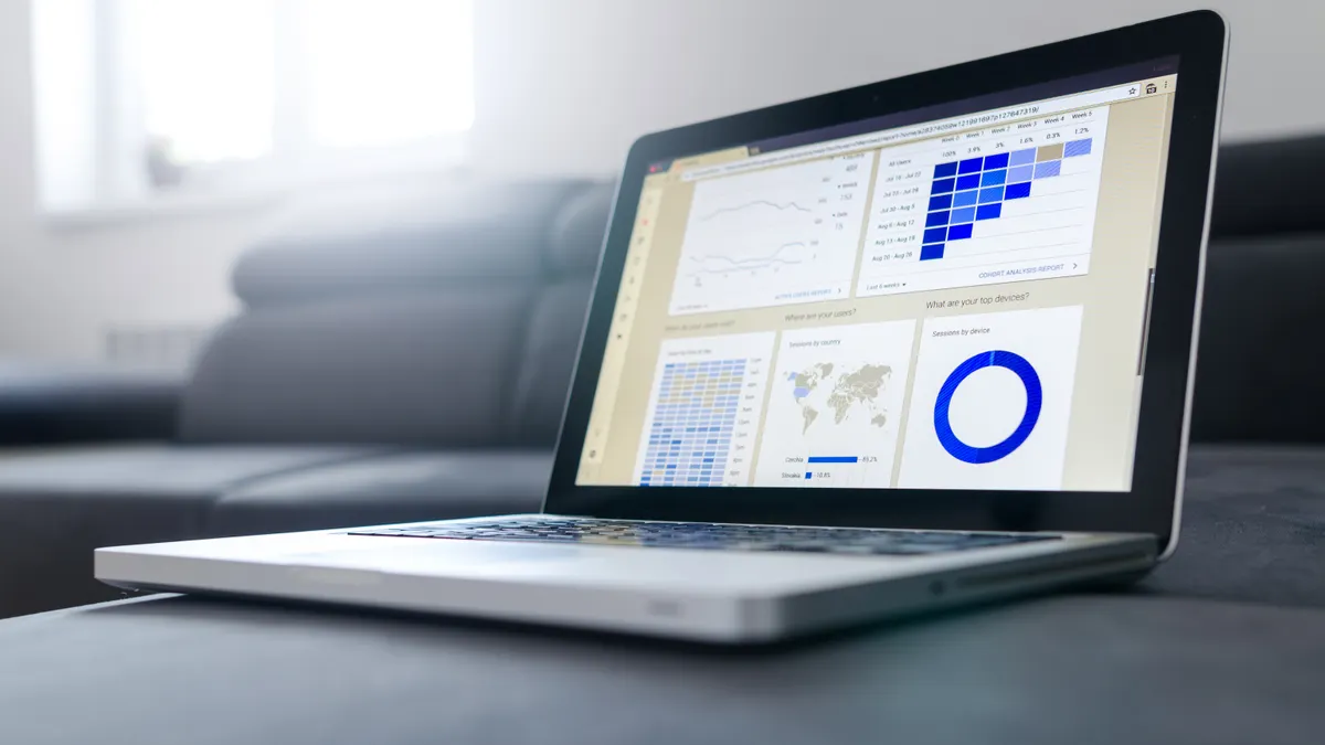
Last updated: November 10, 2026
Key Takeaways
- The dashboard is the account hub, while deeper tools live in other sections.
- The sidebar groups the main areas into one fixed navigation column.
- Widgets turn the home screen into a quick snapshot, not a blank page.
- Use the sidebar for section jumps, widgets for shortcuts, and account controls for profile changes.
The Ranknar.com dashboard is the main screen you use to see account status, move between tools, and reach settings without hunting through the site. If you only need to understand what each area does and how to move around it, this guide covers the Ranknar.com dashboard, the sidebar menu, widgets, reports, and account settings.
What the Ranknar.com dashboard is for
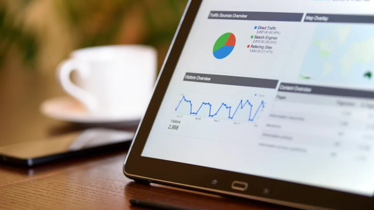
The Ranknar.com dashboard is the control center for the account, not the place where every feature lives. It gives you a starting view of what is happening, plus quick paths into the parts of ranknar.com you will use most often.
Think of it as a command panel with a few jobs. It surfaces summaries, lets you switch between sections, and shows where to manage account settings. On a well-built software dashboard, that often means navigation, status, and the next action are close at hand. Ranknar.com follows that pattern, which is why the dashboard matters even if you never spend long on it.
The main thing to understand is that the dashboard is not the same as the full feature set. A generic article often blurs those together and leaves the reader thinking every tool must be on the first screen. That creates confusion fast. The dashboard usually shows condensed views, while deeper work happens after you open a section from the sidebar menu or a report page.
That trade-off is the point. A dashboard is designed to reduce friction, not to display everything at once. If you want the full breadth of ranknar.com features, the dashboard is the doorway, not the destination. Use it to orient yourself, then move into the page or module that matches the task.
It also helps to know what the dashboard is not for. It is not the best place to study long-form details, and it is usually not where you configure every setting line by line. If you need a clean, fast overview, the dashboard is right. If you need deep configuration, the smaller settings pages are the better fit.
How the sidebar menu is organized
The sidebar menu is often the fastest way to move through the Ranknar.com dashboard because it groups the main areas into a fixed navigation column. Most users will use it far more often than any top banner or welcome panel.
A sidebar menu works best when it stays stable. That stability matters because it reduces guessing: the same labels should lead to the same places every time, even after a refresh or a new session. If you are new to ranknar.com, the sidebar is where you start building a mental map of the product.
Here is the practical way to read it:
- Scan the top-level labels first, not the nested items. The main categories tell you the product’s structure in about 5 seconds.
- Click one section at a time and look for subpages or expandable groups. This shows where the dashboard keeps related tools together.
- Use the active highlight state to confirm where you are. A selected item should stand out clearly from the rest of the menu.
- Return to the same menu item when you need to retrace your path. Stable navigation saves time more reliably than searching the whole screen.
- If a section seems missing, check whether it is nested under a parent label rather than listed on its own line.
The cost of ignoring the sidebar is simple: users start hunting through widgets for tasks that belong in a separate section. That wastes time and often leads to the wrong page. The fix is to treat the sidebar as the map and the widgets as the summary layer, and if the layout still feels unclear, consult the product’s help resources or a qualified support professional. The same navigation pattern is echoed in standard usability guidance from the Nielsen Norman Group and in general web interface practices from W3C.
A good dashboard menu should also work at a glance on a laptop display around 13 inches and on larger desktop screens. If you need to collapse or expand the sidebar to see more content, that usually means the dashboard is balancing navigation depth against screen space. That is normal, and it is one of the main usability trade-offs in software like this.
For the broad product context, this page fits alongside the main ranknar.com features hub without repeating it.
Which widgets matter most on the dashboard?

The widgets matter because they turn the dashboard into a snapshot instead of a blank landing page. A widget is a small content block that surfaces one kind of information, usually in a compact card or panel.
The first thing to look for is whether the widgets answer the three questions a busy user has in under 10 seconds: what changed, what needs attention, and where to click next. That is the job of a dashboard widget. It should reduce reading, not create it.
In most software dashboards, widgets fall into a few recognizable types:
- status widgets that summarize current account conditions
- action widgets that point to the next task
- summary widgets that condense activity into a short view
- shortcut widgets that link straight to a deeper page
The detail that many generic guides skip is this: widgets are useful only if you know what level of depth they represent. A widget is not usually the final answer. It is a pointer. If you click through and find a fuller page, that means the dashboard is doing its job by keeping the first screen light.
A useful test is whether a widget has one clear job. A panel trying to show 8 things at once becomes decoration. A panel showing one status, one summary, or one action stays useful. This is especially true on dashboards built for recurring use, where the same 4 or 5 panels get checked daily and the rest can be ignored.
If a widget looks familiar but not immediately useful, it may still matter later. Many dashboards keep lower-priority information visible because it supports periodic review, such as weekly summaries or account-level notices. That is practical, but it can also make the first screen feel crowded. The trade-off is visibility versus focus.
The best way to use widgets is usually to read them in order of urgency: alerts first, summaries second, shortcuts last. That habit keeps the dashboard from feeling busy and helps you decide whether to stay on the home view or move deeper.
How do I handle the Ranknar.com dashboard?
You handle the Ranknar.com dashboard by using the sidebar for section jumps, the widgets for shortcuts, and the account area for profile-level changes. That is the basic path through the interface, and it keeps the main screen from turning into a maze.
For a beginner, the easiest approach is to treat the dashboard as a 3-layer layout. The left or side navigation gives structure, the central area shows summaries or work panels, and the account settings area handles identity and preferences. You do not need to memorize every label on day one. You need to know which part of the interface answers which kind of question.
A simple navigation rhythm looks like this:
- Start on the main dashboard view and identify the sidebar menu. This is where you will spend most of your navigation time.
- Use one menu item to open a single section rather than clicking multiple items at once. That keeps the layout readable and prevents you from losing your place.
- Read the central panel for a summary of the section you opened. The result should be a clearer view of that task, not a new puzzle.
- Use any widget or inline shortcut only when it clearly matches the task you want. Shortcuts are for speed, not exploration.
- Return to the dashboard home when you finish. That resets the view and makes the next visit faster.
The most common mistake is treating the dashboard like a search engine. That usually leads to random clicking, especially when a user expects every tool to be visible immediately. Dashboards are built around grouping, not universal exposure. If you open the wrong section, back out and follow the sidebar instead of trying to force the widgets to do the work of the menu.
There is also a practical speed advantage here. A well-organized dashboard can save a user from opening 4 or 5 separate pages just to understand what is happening. But that only works if the navigation labels are clear and the sections are not overloaded. If the labels are vague, the dashboard becomes slower even if the software behind it is powerful.
For someone coming in cold, the rule is simple: sidebar first, widgets second, settings last.
Where are settings on the Ranknar.com dashboard?
The settings are usually in the account settings area, not in the middle of the dashboard widgets. That placement is deliberate because settings change identity, preferences, or how the account behaves, which is different from day-to-day monitoring.
Look for the account settings link in a consistent place, often near a profile icon, user name, or bottom section of the sidebar. That is the part of the interface most users overlook first, because they expect settings to appear as a large page on the dashboard itself. In most modern software, settings are tucked away to keep the dashboard clean.
This separation matters. A dashboard should answer “what is happening?” while account settings answer “who am I, and how should this account behave?” Mixing those two jobs makes the screen harder to use. Keeping them apart is cleaner, even if it costs one extra click.
Typical account settings areas include profile details, notification preferences, and interface choices. You should expect settings to feel narrower than the main dashboard and more form-like than visual. That is a sign you are in the right place. If you are on a page that shows lists, cards, or summaries, you are probably still in the dashboard layer rather than the settings layer.
One thing that trips people up is assuming every setting belongs to the same page. It often does not. The account area may split changes across 2 or 3 screens, especially if the product separates security, profile, and preferences. That is normal design, not a mistake.
The trade-off is obvious: settings are easier to maintain when they are centralized, but slower to find when you first arrive. The fix is to learn the account icon or menu position once and use it consistently. After that, the dashboard becomes easier to use because you know exactly where the control points live.
Reports and summaries: what to expect from the dashboard
Reports and summaries on the dashboard give you a compressed view of activity, not the full record. They exist so you can check progress quickly and decide whether to open a deeper page.
A summary panel usually answers a simple question in one glance: what is the state of the account right now? A report area usually goes a step further and groups information over a period of time, often in a compact format. Even when the dashboard does not show every metric, it should still show enough to tell you whether to stay put or click deeper.
Here is the useful distinction:
- summaries are for fast reading
- reports are for review
- detailed pages are for analysis
That distinction matters because a lot of readers expect “report” to mean a complete export or a long list of data. On a dashboard, it usually means a quick view with a path to more. If you need the broader analytics experience, that is a separate layer and belongs on a different page in the site structure.
The practical benefit is speed. A dashboard summary can cut the time it takes to orient yourself from several minutes to a few seconds, especially when you check the account daily or weekly. The limitation is depth. A summary will not explain every line item, every trend, or every exception. That is why dashboards pair summaries with links, drill-downs, or detailed report pages.
A generic article often misses this and treats the summary as if it were the answer. It is not. It is the prompt. If a widget shows a change, a count, or a status shift, your next move is to open the linked page or report section and inspect the details there. That is the right workflow for nearly every dashboard.
If you want the deep-dive layer, look to the dedicated ranknar.com analytics page rather than trying to force the dashboard to do all the work.
What the dashboard gets right — and where it falls short
The dashboard gets the main job right when it saves time, but it falls short if you expect it to replace every deeper page. That balance is the core trade-off of any software dashboard, including ranknar.com.
What it does well is reduce friction. A user can enter, scan 3 or 4 widgets, open one sidebar item, and leave with a decent sense of what matters. That is the value of a dashboard built around summaries and navigation. It keeps the first screen readable and the account close at hand.
What it does less well is detail. If you are trying to compare a long history, inspect granular data, or change multiple account preferences at once, the dashboard will feel too shallow. That is not a defect so much as a design boundary. A dashboard should not be a spreadsheet, a settings panel, and a report center all at once.
There is also a mismatch to watch for. New users often expect the dashboard to explain itself in full. Most software does not. It assumes you will recognize the structure after a few visits, usually within the first 2 or 3 sessions. That means the dashboard is best for repeat use, not for one-time discovery.
The honest judgment is this: ranknar.com’s dashboard is useful for orientation and fast access, but it is not the right place for deep analysis or detailed configuration. That makes it a good fit for users who want a central hub and a poor fit for anyone expecting a single screen to do everything.
What should I learn first if I am new to Ranknar.com?
You should learn the sidebar, the widgets, and the account settings in that order because they tell you how the dashboard is organized. Once those 3 pieces make sense, the rest of the interface becomes much easier to read.
The quickest way to build confidence is to open one section from the sidebar, glance at the widgets, then find the account settings area. That 3-step pattern gives you the structure without forcing you to memorize every label. After that, you can move from the home view to deeper pages without getting lost.
If you want the shortest path, focus on navigation first and reports second. Navigation tells you where things live. Reports tell you what the data or summaries mean.
What do the sections of the ranknar.com dashboard mean?
The sections of the ranknar.com dashboard are the main parts of the interface: navigation, summary panels, and account-related controls. Each section has a different job, so the labels are meant to help you move quickly rather than explain every feature in detail.
If a section looks like a widget, it is usually there to summarize or shortcut. If it sits in the sidebar, it usually controls where you go next.
Drafted with AI; not yet reviewed by a person.